
No matter the methodology, we calculate energy savings or production using data. Sometimes, however, the data is missing or appears to be an outlier due to a variety of reasons. When this occurs we need to figure out why and how to fix it. Let’s dig into a recent issue with my solar panels as an example.
The Backstory
I am an unapologetic energy nerd. So it is no surprise that I love regularly looking at the online data dashboard for my home’s solar PV system. I find it so interesting that, despite the hour-to-hour changes in weather in New England, over time the daily and annual production follow the expected curves.
It has been a busy spring and I haven’t checked the dashboard as often as usual, so I was surprised when I looked at the end of March to see the following output graph. What happened?!
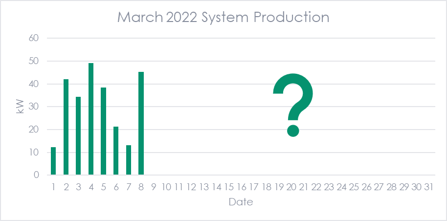
It turns out that when I moved my Wi-Fi router to a different room as part of a kitchen renovation, I somehow messed up the communication from the inverter to the online dashboard. I eventually figured out how to fix it, but it left me with a huge data gap from March 8 to April 24. Fortunately, the PV panels and meter were still working the whole time, so my utility has the correct net usage and my SRECs will be counted correctly. Basically, the only lasting issue is now the nerdy charts I make in my spare time will not be totally accurate because of the missing chunk of data.
But this got me wondering what would happen if my solar production data was used in an evaluation. Would I be able to spot this issue? How would I treat it?
The Wonky Data
You can often spot issues in data just by creating a graph.[1] Let’s continue to use my solar PV system as an example of potential data issues. The chart below shows the system’s production by month from 2018 to 2022. The orange curve represents the PVWatts estimate.[2]
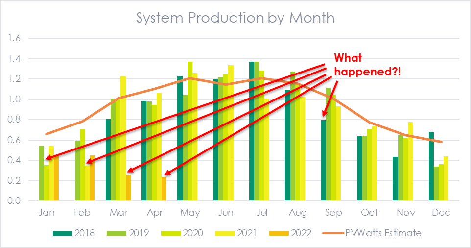
While there is a variation for every month (because it is the weather in New England) there are a few outliers that really stand out. I dug into each of them and found that the reason for the large variation from the expected value was different in each case.
- January 2020 – My utility swapped out my electric meter and threw the disconnect switch and never turned it back on. I didn’t notice for about two weeks, during which time no electricity was generated.
- February 2021 and September 2018 – As far as I can tell, these were just very dismal months with lots of precipitation and gray days. The system was online and making electricity every day, just very small amounts of it.
- March and April 2022 - As discussed above, the system was making electricity during this period, but it was not connecting to the online dashboard to record the 15-minute data.
Although this example is specific to the output of my solar panels, similar issues surface in all energy efficiency or renewables projects. There are often periods where the equipment’s operation and savings are not as planned, but they are not all the same. In these cases, we need to understand the reason behind the variation before we can figure out how best to handle them. If possible, speaking to the homeowner or facility manager about the questionable data can provide very valuable insight.
The Treatment
Before addressing each of those issues, we need to understand the context of our analysis. Are we looking to determine the energy use/production/savings for a specific system over a certain period of time to true up a bill? Is this a sampled project that is representative of other similar projects for a program evaluation? Is this one of thousands of homes/devices being analyzed? The decisions taken to treat the issue may be different in each scenario.
In some cases, a two-week pause in production like my January 2020 example may be considered a non-routine event and accounted for in regression or other analysis. A similar example could be if an industrial facility stops production for a few days to replace some equipment. Other, more planned events that could affect savings include summer vacation months in schools or holiday shutdowns in factories.
In the course of analyzing the data for non-routine events, an evaluator might come across a situation like my March/April 2022 example where there is a mistake in the data. In this case, we would need to impute the data from other sources, likely including some combination of utility data, BMS data, models, and engineering assumptions.
For other instances of outlier data, we need to understand the reason for the large variation. This is important because additional variables may need to be included in the analysis to better explain the production/savings. In the case of solar PV systems, the output is directly linked to insolation, the amount of solar energy hitting the panels. PVWatts and other calculators estimate this using typical weather data from TMY3 or similar sources. However, snowfall also has a large effect on production. The bluebird day after a big snowstorm would be great for producing electricity with solar panels, except that they are covered in snow! This seems to be the reason why the PVWatts curve in the figure above is pretty accurate for March through November but overestimates production in the winter months. Adding in a variable for snowfall would likely make a PV model more accurate.
[1] And also through more quantitative tests, such as flagging records that are a certain percentage or certain standard deviations from the mean.
[2] Note that this was just a quick estimate using industry average assumptions for system losses, tilt, inverter efficiency, etc. A more precise estimate could be developed using the actual specifications from the system.