%20(1200%20x%20628%20px).png)
Last month’s post discussed the need for proper accounting of energy sources to accurately quantify carbon[1] emissions. With that as a background, we can now dive into the importance of the timing of energy use and savings. The carbon content of electricity is both temporal and locational – some areas and time periods have cleaner electricity than others due to the generation mix in that place at that time. One kilowatt of electricity is not equal to another – we need to consider how and when it was produced and used.
Setting the Stage
Our field of energy efficiency has historically focused on reducing overall energy use. Another benefit of energy efficiency is the reduction in peak energy demand (the electricity used during the system peak hour). Demand response provides additional demand reductions during peak times above and beyond energy efficiency. Taken together, this means that energy efficiency and demand response programs traditionally may only care about a handful of days per year – the system peak and a few events called by the ISO.
However, the time when energy is used is becoming increasingly important as renewable energy and storage grow rapidly. Once you shift mentality from the old construct of simple energy efficiency to demand/carbon management, the timing of savings becomes very important. However, this shift in outlook should not stop at the value of certain hours over others; we should also be thinking about the timing of impacts in the medium and long term and evaluate impacts through the lens of multiple time periods. Some of these issues may seem insignificant on an individual basis, but they add up to considerable impacts when aggregated. If our goal is to reduce carbon emissions, we need to accurately track if and when the reductions are occurring.
Load Shapes
To visualize when energy is produced, used, or saved, it can be graphed as load shapes, where the x-axis represents the time period (hour, day, month) and the y-axis represents the energy produced/used/saved (or percent of peak load). Load shapes can either show the variation in energy demand for a utility (or energy produced) over time, the variation in consumption for an end-use, or the variation in consumption from an efficient piece of equipment compared to its baseline.
The chart below provides example load shapes. It shows the summer (June to July) residential load shapes for three end uses in Middlesex County, MA, where I live. As you can see, the energy used for cooling is lowest at night and in the early morning and rises throughout the day to peak in the late afternoon (aligning with the New England ISO system peak). By comparison, the energy used for plug loads is very stable throughout the day, while the energy used for interior lighting is low throughout the day, highest in the evening, and very low after midnight. Although improving the efficiency of any of these end uses would reduce the overall energy use, targeting cooling equipment in the afternoon would have the greatest impact on reducing demand when the electric grid is likely most burdened. Shifting that energy use to earlier or later in the day through some sort of storage may not reduce overall energy consumption, but would help reduce demand at peak times.
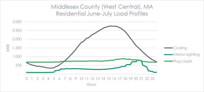
Source: NREL ResStock National Load Profiles by PUMA Northeast 2018
Saving energy overall and at certain times has been the traditional goal of energy efficiency. However, laying carbon on top of it makes the timing of when energy is used or saved even more important. This is because the mix of resources used to generate electricity changes over time during the day and over the year. For example, below is a chart showing the mix of generation by fuel for MISO in June and October. While the generation from nuclear and wind are similar in both charts, the amount of electricity generated from coal and natural gas are very different. Interestingly, even though the total amount of energy generated on October 1 was more than what was generated on June 1, the total carbon emissions were lower due to the higher share of natural gas in the mix.
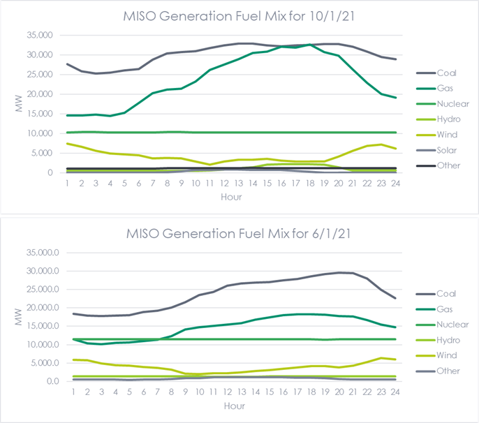
Source: MISO
Knowing the amount of electricity generated per day allows us to create a carbon load shape. Below are the estimated carbon load shapes for MISO on June 1 and October 1.[2] Two things stand out. First, you can see that the carbon emissions from the electricity generated in October are lower than those seen in June. Second, the June carbon load shape has more variation over the course of the day, likely due to cooling in the afternoon. Notably, the carbon load shape of a state like California with a much different fuel mix and very high solar penetration is going to look much different and more like the infamous duck curve.
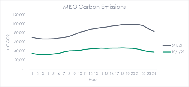
Source: MISO, EIA
Armed with the knowledge of when the carbon intensity of electricity is greatest, we can better implement energy efficiency measures so that they help manage demand and carbon emissions. Additionally, we can create frameworks - like California’s Avoided Cost Calculator - that better reflect the value of saving energy when it is needed most, rather than when there is so much solar PV production being curtailed.
Claiming Annual Savings
Most programs account for savings on an annual basis, meaning that a program will claim the same amount of savings in their program year regardless of when it is installed. For example, a program will claim the same savings for a measure installed on December 31, 2021 as one installed on January 1, 2021. In the old scheme, this was fine because programs only cared about total energy savings per year.[3] Additionally, those measures would accumulate savings over its life[4], and a measure installed at the end of year one would have the full year of savings in its final year of life.
In a carbon accounting paradigm, timing matters more. First, because each hour of the year has a different carbon intensity, including or not including the measure’s savings during the summer when carbon emissions tend to be the highest, it matters for the carbon ledger. This figure shows how the historical carbon emissions in California have decreased over time and tend to be lowest in the spring and highest in the summer.
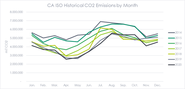
Source: CA ISO
Second, if the carbon intensity is expected to decline over time as the electric grid becomes cleaner, then a full year of savings this year (i.e., a measure installed on January 1) instead of a half year of savings has a greater carbon impact than the same number of days in year 15.
For some programs, the installation of measures may be fairly constant over the course of the year. However, for some programs like C&I Custom programs, participation tends to take a hockey stick shape with most of the projects completed toward the end of the program year. For these programs, assuming a full year of savings/carbon reductions when most savings begin in Q4 may lead to a faulty view of the program’s actual impact.
Timing of Project Savings
Another aspect of timing to think about is when to begin counting savings for measures that do not have a defined start date. Controls or behavior-based measures (e.g., SEM and EMS) may require a blackout period at the beginning of the project to account for a setup and optimization period. When reviewing a facility’s energy use, we may not see an impact (or we may even see an increase in usage) as controls are set up and optimized and people are trained. This initial period is not reflective of the program/measure’s true (or at least expected) impact over its life. As a result, programs and evaluators may want to consider when the best time is to start counting savings or begin the “post” period in their regressions.
[1] Carbon is shorthand for carbon dioxide
[2] I calculated these carbon emissions using national averages from EIA. The actual carbon emissions from MISO will be different due to the variation in emissions from specific power plants.
[3] As well as peak demand savings in some cases
[4] More specifically, its effective useful life, a deemed value which may or may not be based in reality.