
Welcome to another installment of the Challenges of Estimating NTG, where we explore the challenges of assigning a numeric counterfactual value to a complex decision-making process. This post will explore some ideas beyond the traditional survey self-report approach common to many programs and evaluations. We’ll explore other NTG methods and then structural causal models and causal diagrams.
Non-Survey NTG Approaches
In addition to survey-based approaches, evaluators have a number of other methods to estimate net savings. The Uniform Methods Project digs into these methods in detail and is worth the read. Two common methods for estimating net savings are randomized control trials and quasi-experimental designs.[1]
In a randomized control trial (RCT), the program randomly assigns customers into either a treatment group (program participants) or a control group (nonparticipants) and then compares the difference in energy use or savings between the two groups. This set up works well for behavioral programs like home energy reports, which apply to very large numbers of relatively homogeneous customers and do not require large investments in energy efficiency measures.
The key benefit of RCTs is that the influence of both observable differences (e.g., location, age/size of building, etc.) and unobservable differences (e.g., attitudes toward energy efficiency) is eliminated. Because both the treatment and control group have the opportunity to implement energy efficiency measures outside of the program, RCTs control for free ridership and (short term) spillover
For most energy efficiency programs, RCTs are not possible or practical. In these cases, evaluators can use quasi-experimental designs to estimate net savings. In these studies, self-selected participants make up the treatment group. This treatment group is either compared to a matched comparison group or to itself over time using panel data in a structured regression model.
Because quasi-experimental studies do not have the benefit of randomization to eliminate potential bias from confounding variables, it is crucial that they are designed well. In practice, it can be difficult to identify a matched comparison group due to unobservable variables that affect energy use or because of the uniqueness of the participants (for large C&I customers). Additionally, a well-designed model assumes that the evaluator can identify all relevant variables that truly matter without overfitting the regression.
If we are ultimately looking for the effect of the program on savings and it is difficult to fully account for all confounding non-program factors, it may be helpful to look beyond overall net savings. Structural causal models may be one way of doing this.
Structural Causal Models
I recently read the Book of Why by Judea Pearl and it got the wheels turning in my head. The book explores causal inference, the idea that humans are good at seeing that certain things cause other things to happen but that it is difficult to teach this to a computer. Artificial intelligence is good at making associations from millions of points of data[2] but is not as good at counterfactuals, such as “was it X that caused Y?” or “what would have happened if X had not occurred?” In order to bridge this gap, Pearl advocates for the use of structural causal models and causal diagrams.
A causal diagram represents a structural causal model. A structural causal model is made of three components: variables (explanatory variables, outcome variables, and unobserved variables), the causal relationship between variables, and the probability of a change in one variable given a change in a related variable.
In addition to explanatory variables and outcome variables, variables may be confounding or mediator variables. Confounding variables are associated with both the explanatory or treatment variable (X) and the outcome variable (Y) that may obscure the causal effect of X on Y. Mediator variables explain (at least some of) the causal effect of X on Y. The figure below shows a simplified example of a causal diagram with a confounding variable and a mediator variable. Each variable is connected to others with an arrow based on its causal relationship and each arrow (path) would have a coefficient.[3]
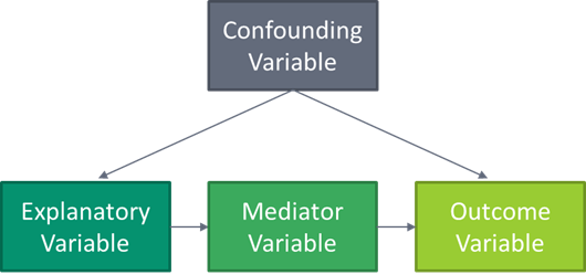
In this example, because the confounding variable has an effect on the explanatory variable, it must be controlled for. However, because the mediator variable is in the causal path between the explanatory and outcome variables, if you control for that, then you block the effect of X on Y because X works by changing the mediator variable.
Now let’s look at how the same simple causal diagram might apply to an energy efficiency program:
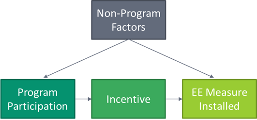
Here we see that non-program factors (e.g., attitude towards efficiency, past experience, size of the company) have an effect on both program participation and whether the measure was installed. To get a clear view of the program’s impact on the installation of the measure, these confounding variables need to be controlled for. In this simple example, the incentive is a mediator of program participation, so controlling for that would prevent us from seeing the effect of program participation on the installation.[4]
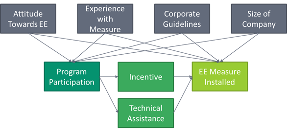
Now in real life, the causal diagram for a real program would likely be much messier and more like the diagram below (and even this is very simplified).
Using Causal Diagrams as an NTG Tool
In Pearl’s book, structural causal models are mathematical models likely based on large data sets from quasi-experimental observation studies. This allows for the development of coefficients for all variables and, ultimately, a number showing the causal effect of the explanatory variable (treatment) on the outcome. Evaluators just do not have that data available for most energy efficiency programs. However, I think causal diagrams can still be useful in all types of NTG research, even the survey-based approach.
Similar to how program theory/logic models provide value in describing how a program is supposed to work, causal diagrams require reflection on why a program works. As Pearl says “unlike correlation, causal analysis requires the user to make a subjective commitment. She must draw a causal diagram that reflects her qualitative belief – or, better yet, the consensus belief of researchers in her field of expertise – about the topology of the causal processes at work.”
Another benefit of causal diagrams is once we understand the variables at play in a participant’s decision to install a measure, we can then research which is most important. In the example above, we see that the program causes the installation through an incentive and technical assistance. But which of these direct effects is more important? Are there indirect effects not included in this model that are also important? Only by making a “subjective commitment” to a causal model can we start asking these questions to improve the program.
[1] Note that these approaches are complex and by boiling them down to a few paragraphs I made some gross generalizations and left a lot out. Please don’t call the data science police.
[2] Such as “based on this database of one million chess games, this move is associated with a higher percentage of wins than that move” or “based on the fact that you listened to Lake Street Dive and Sammy Rae & the Friends, you might like Busty and the Bass.”
[3] Note that arrows only show that there is a relationship – it may be positive or negative.
[4] This is a simplified example. In real life, many programs have other ways beyond incentives to influence the adoption of energy efficiencies, such as technical resources and assistance.